Behind the memories
Tech Romancer: An Entire Robot Anime Shelf in One Game
Capcom gave every giant robot its own kind of show. The paintings, pilots, and imaginary series logos in Capcom Design Works reveal the idea behind this exuberant arcade and Dreamcast fighter.
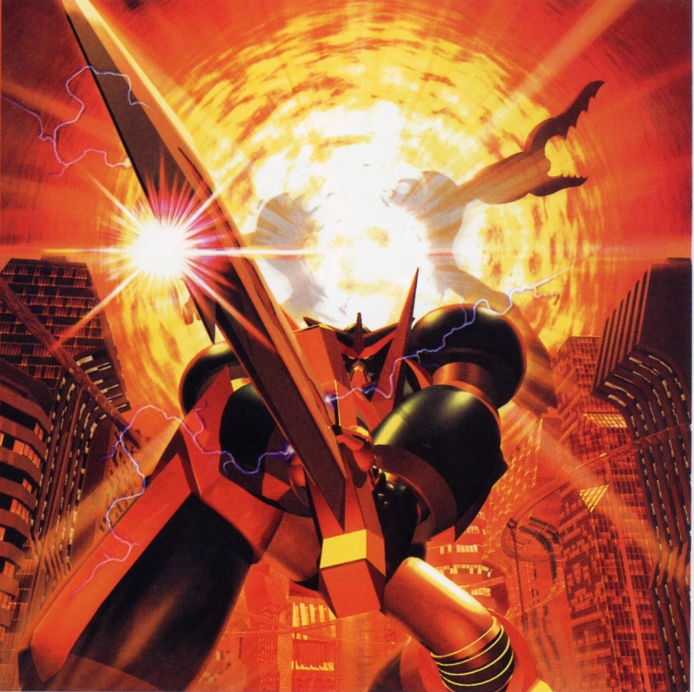
Overseas Dreamcast jacket artwork, credited in the book to 酒井奨.
Capcom Design Works · Capcom / Enterbrain, 2001Artwork source ↗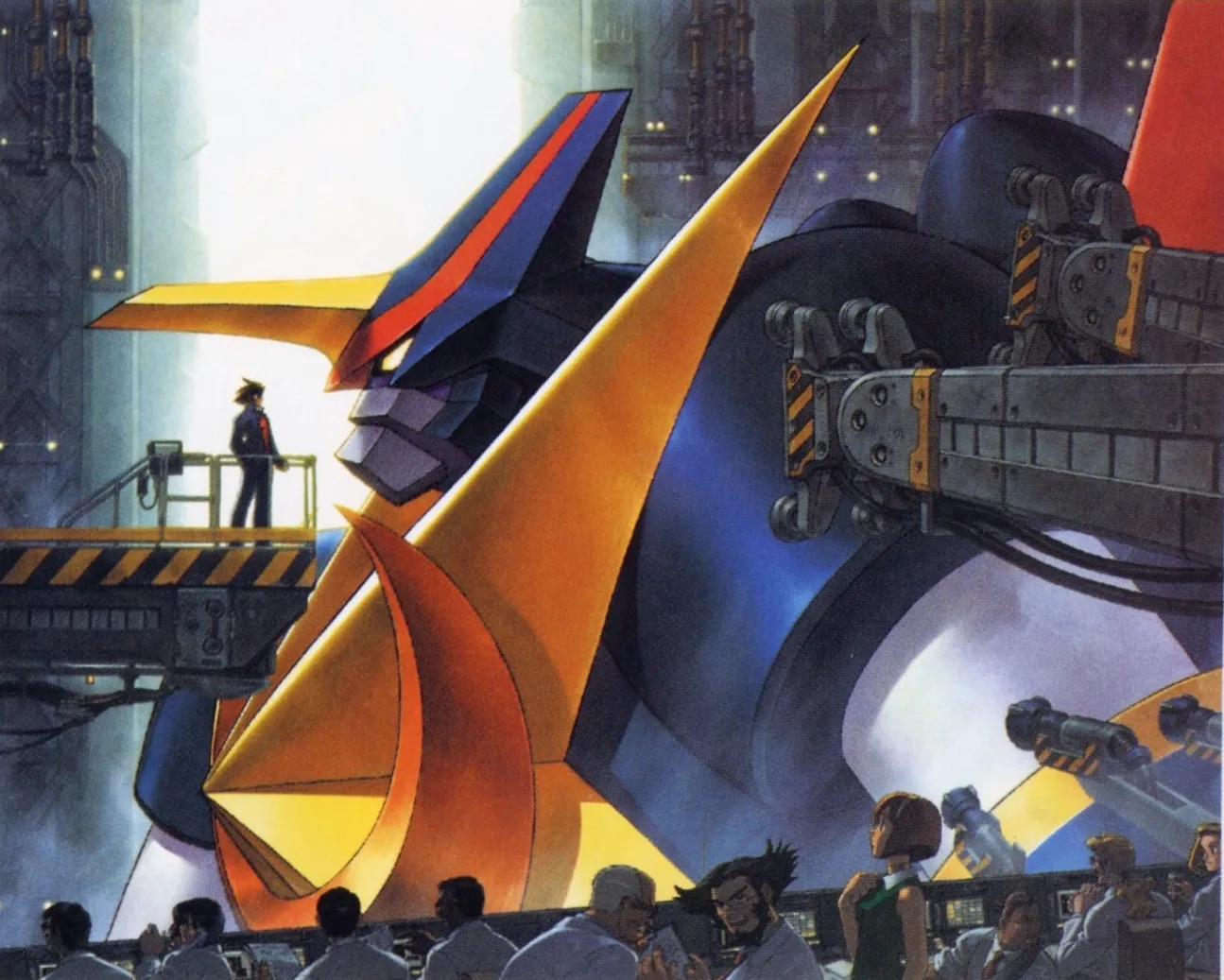
A boy stands on a gantry in front of a giant robot’s face. Below him, technicians gather among the machinery. The robot’s gold crest reaches past the platform, and its blue head is so large that the people look like visitors in an aircraft hangar. There is no punch, no explosion, and no defeated enemy. The excitement comes from the possibility that this enormous thing might wake up.
That is the Japanese Dreamcast jacket illustration reproduced in Capcom Design Works. On the same page, the overseas jacket sends the robot straight into an inferno, sword raised between skyscrapers. One picture offers the anticipation of becoming a pilot; the other offers the spectacle of being a giant warrior. Together, they open a useful window onto Tech Romancer, Capcom’s robot fighting game: a game interested in the whole fantasy, from the people beneath the armor to the impossible finishing blow.
Known in Japan as Choukou Senki Kikaioh, the game belongs to Capcom’s late-1990s arcade output and reached the Dreamcast in 2000. Its most appealing design idea is visible before anyone throws an attack. The roster looks like a collection of different robot programs brought together for one extravagant confrontation. Every machine comes with a human cast, a mood, and a promise about the story it ought to inhabit.
A fighting game for the robot generation
There is contemporary evidence that this breadth was deliberate. Near the end of a 1998 Gamejin interview about Cyberbots, producer Takashi Shouno introduces the forthcoming arcade game. He names Shoji Kawamori and Kazutaka Miyatake of Studio Nue as collaborators and describes a world encompassing super robots, real robots, transforming machines, and combining machines. Manga artist Kosuke Fujishima notices that the logo changes for each robot and reacts enthusiastically to the pilots calling out their attacks.
That exchange matters because it moves the discussion beyond resemblance. We do not have to deduce the entire premise from a robot’s helmet or a pilot’s haircut. The producer was presenting the game as a meeting place for different branches of robot entertainment. Studio Nue’s involvement also places the project in direct conversation with the people who helped develop that visual language.
The artbook lets us see how the idea became a presentation. Printed pages 126 and 127 arrange eight robot-and-pilot groupings against a blazing orange background. Each grouping carries a different title treatment. Some logos are angular and metallic; another curls around a cheerful magical heroine. They resemble the titles of separate shows, each trying to catch your eye from its own corner of a magazine.
The effect is closer to browsing a shelf of robot anime than inspecting a squad from a single military organization. There is enough shared color and energy to hold the collection together, but very little pressure to make everybody look as though they came from the same factory.
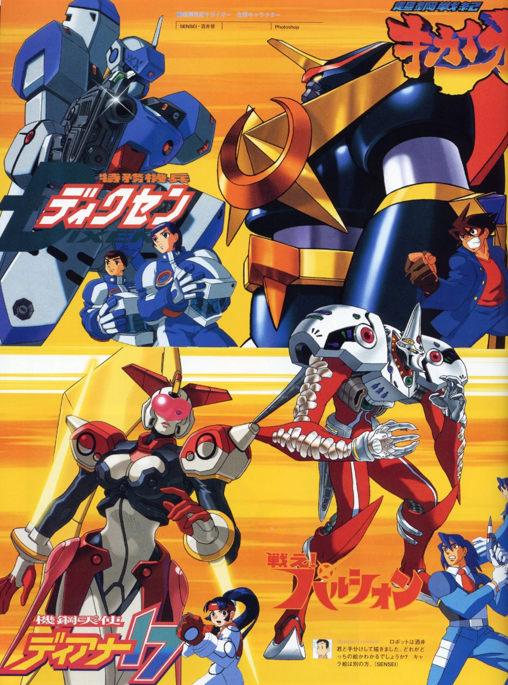
Four different promises of adventure on one page. Artwork from Capcom Design Works, printed p. 126 / PDF p. 127. The page lists SENSEI and 酒井奨 and includes a comment about dividing work on the robot illustrations. © Capcom.
Machines that tell you what kind of story to expect
Kikaioh is the anchor. Its enormous rounded forearms, dark armor, gold chest ornament, and red shoulder points give it the ceremonial bearing of a super robot. The human beside it is equally declarative: Junpei has unruly hair, a blue jacket, a red shirt, and the expression of someone ready to commit to a fight before receiving a sensible explanation. The North American manual calls this machine G. Kaiser; the Japanese artwork uses Kikaioh.
Dixen offers another invitation. Its blue and white armor breaks into hard plates, and a conspicuous firearm occupies the foreground. Its pilots wear matching uniforms. Read visually, the pairing suggests service, training, and an organized force. Kikaioh’s chest emblem is a statement of identity; Dixen’s equipment appears to be something issued for a job. That distinction carries a great deal of storytelling without requiring a paragraph of exposition.
Diana 17 changes the silhouette again. The red, white, and dark armor follows a humanoid figure, with a glossy pink forehead element and broad shoulder forms. Reika’s small portrait repeats the pairing of a recognizable person with a much larger mechanical personality. Pulsion, meanwhile, has red limbs, pale rounded shoulders, and ribbed sections that make its body feel less like stacked armor and more like an articulated creature.
These are visual readings of the illustrations. They explain how the designs communicate; they do not establish a documented one-to-one relationship with particular anime characters. The familiar vocabulary is part of the pleasure. The game can summon several kinds of robot adventure without requiring the player to recognize a specific reference.
Room for soldiers, magic, and combining heroes
Turn the page and the contrast becomes even wider. Wise Duck is built around a long cannon, boxy armor, and olive coloring. Its accompanying human group has a rougher, more practical appearance than the bright young heroes nearby. Everything in the composition suggests heavy equipment and the effort involved in moving it into position.
Then there is Bolon. A giant round blue body carries bright yellow hands and a collection of objects that refuse to resolve into conventional military hardware. Polin flies across the composition with pink hair, an enormous bow, and an exuberant expression. Put beside Wise Duck, the scene becomes a joke about just how much the word “robot” can contain. Both belong on this page, even though their imagined worlds would demand very different explanations.
Twinzam V brings red, blue, white, yellow, and green into a dense arrangement of armor and geometric parts. The two youthful characters beside it underline the idea of shared heroism. Refaga’s aircraft-like surfaces and projecting equipment offer yet another flavor, accompanied by a pilot in an orange suit. Across the page, the designs shift from fairy-tale invention to military mass, team spectacle, and aviation.
What makes the spread satisfying is the care given to the human half of each pairing. A machine’s body supplies scale and power. The people supply attitude. Even when the robot takes most of the page, a pilot’s costume or gesture helps establish whether the adventure should feel earnest, professional, mischievous, or wonderfully ridiculous.
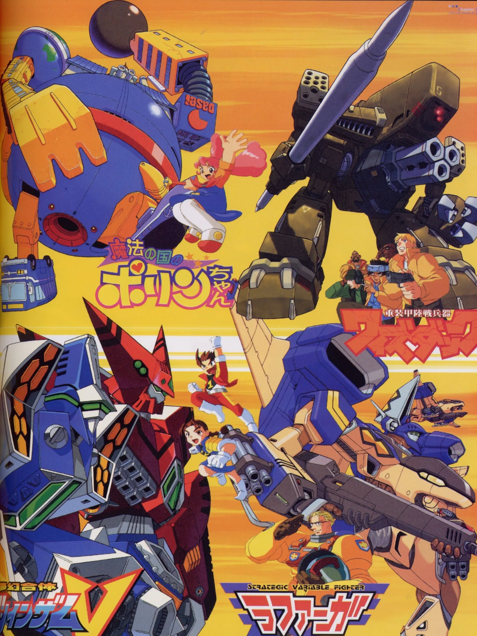
Magic and heavy machinery occupy the same roster. Capcom Design Works, printed p. 127 / PDF p. 128; artist credit 酒井奨. © Capcom. The names in the article follow the North American manual where applicable.
Before the robots take shape
Twinzam V’s combined portrait is only one arrangement of its two machines. Capcom’s manual describes two fighter jets joining into two different forms: Twinzam 1, Fire Formation, and Twinzam 2, Plasma Formation. The move lists give the Fire form its magnum and tomahawk attacks and the Plasma form its missiles and drill attacks; Change Cross Twinzam switches the arrangement. Capcom’s Dreamcast manual, printed pp. 20–21 / PDF pp. 24–25.
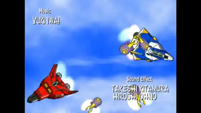
Before combination: Twinzam’s two jets in the Dreamcast opening, around 0:56. Frame from Capcom’s game animation, preserved with its original credits. Intro uploaded by adventkamen. © Capcom.
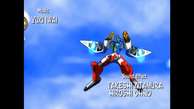
The opening’s blue-over-red Twinzam configuration, around 0:55. Compare it with the red upper body and blue lower body in the book’s Fire Formation portrait above. The manual names these Plasma and Fire Formation. Intro uploaded by adventkamen; Capcom manual, pp. 20–21. © Capcom.
Refaga approaches transformation as a change of role. The manual distinguishes an airborne Fighter Mode, a ground-fighting Soldier Mode, and Spinner Mode, which combines features of the two. Its illustrated robot posture belongs beside a view of the aircraft, rather than standing in for all its configurations. Capcom manual, printed p. 18 / PDF p. 22.
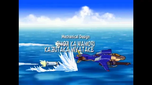
Refaga as an aircraft, around 0:23 in the Dreamcast opening. Compare the blue surfaces, tan nose and projecting weapon with the book’s robot illustration. Intro uploaded by adventkamen. © Capcom.
The complete opening is embedded below, so these separate machines and alternate arrangements can be watched in motion as well as compared with the printed artwork.
Even the enemies belong to different shows
The following page extends the idea to the opposition. Goldibus is a mass of teeth, claws, black surfaces, and red markings. Mouths appear where a more reassuring machine would have armor panels. It reads as the kind of enemy whose arrival changes the weather and makes the heroic music stop.
Gamda takes a different route to menace. Its ochre body resembles ancient masonry, with architectural shapes, greenery, and an immense eye in the torso. The surface suggests something discovered or awakened rather than assembled on a modern production line. Beside it, the composition places a blue-green figure with gold ornaments and a floating, ringed form.
These opponents broaden the imaginary schedule. The heroic machines already suggested different protagonists; the enemies imply different kinds of climaxes. A military robot, a magical contraption, and an ancient stone giant do not need identical explanations to share a fighting arena. Their differences are the reason the meeting is interesting.
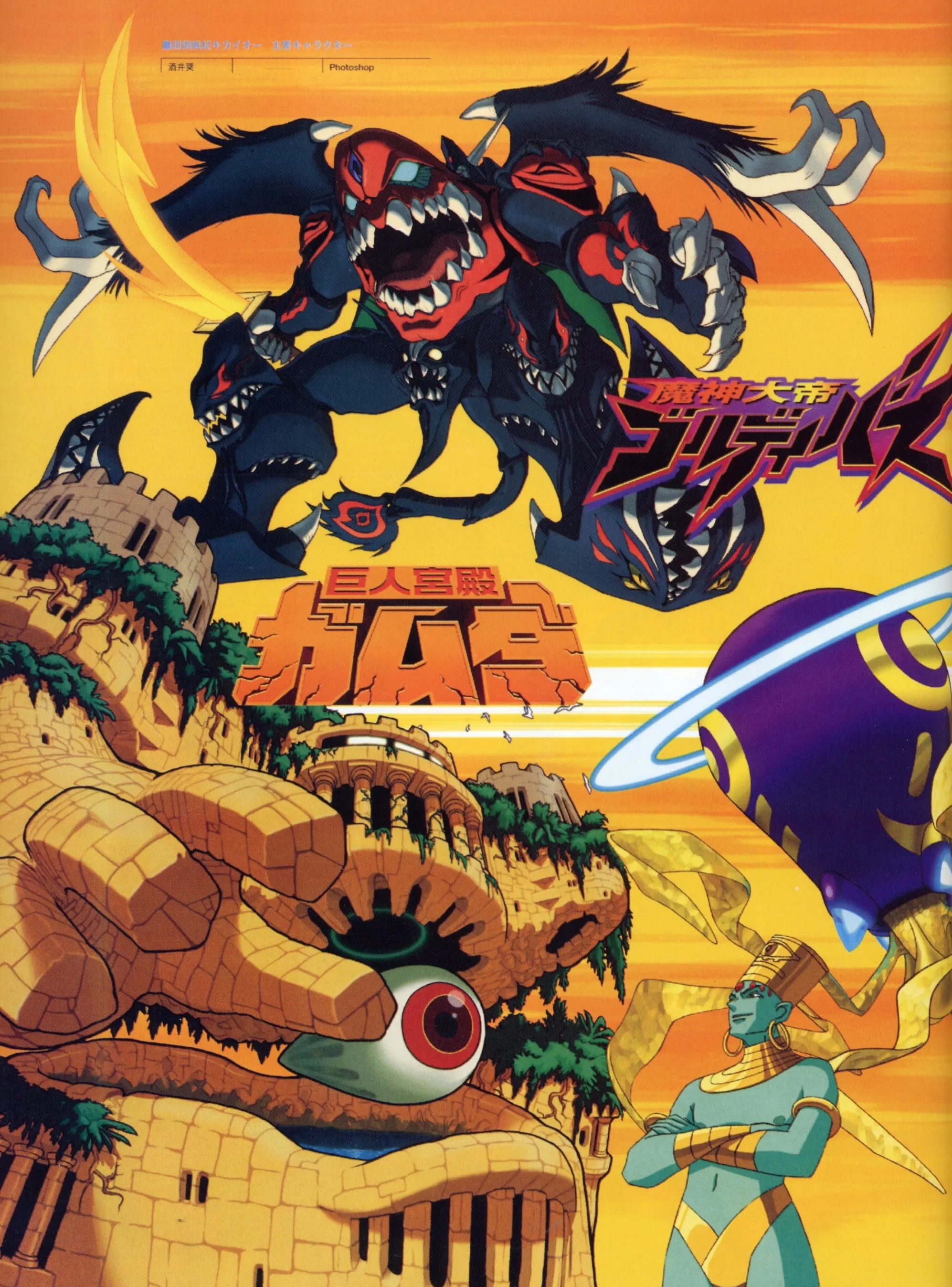
Two very different kinds of menace. Capcom Design Works, printed p. 128 / PDF p. 129; artist credit 酒井奨. © Capcom.
Giving the fantasy controls
The Dreamcast instruction booklet describes movement in all directions, two attack functions, guarding, and jumping. Damage and armor have separate gauges; losing armor makes the machine more vulnerable. Objects on the stage can yield items, including repairs, ability boosts, and robot-specific weapons. Under the default rules, a fighter must fill the opponent’s damage gauge twice to win. Story Mode gives each robot its own story.
Those systems give the illustrations something to do. The hardware can suffer, recover, and acquire new advantages during the confrontation. A machine is both a character and a piece of equipment under pressure. The resulting fantasy accommodates a pilot struggling to keep the robot intact as readily as a hero building toward a spectacular attack.
The different stories also fit the artwork’s collection of imaginary programs. Choosing a robot means choosing a protagonist and a tone, as well as a set of attacks. The bright logos and the pilots’ poses make that choice attractive before the player knows the practical differences between fighters.
The Dreamcast opening provides a view of the game’s animated presentation alongside the still illustrations. The book remains the source for the artwork credits and production details discussed below.
One robot, two covers
Return to printed page 125 and the marketing contrast becomes especially revealing. The overseas jacket surrounds Kikaioh with blazing orange light. A sword makes a powerful diagonal across the picture, and buildings squeeze in from either side. The book’s production line credits 酒井奨 and lists SOFTIMAGE 3D and Photoshop. The illustration sells immediate scale and impact: a giant figure, a giant weapon, and a city caught inside the action.
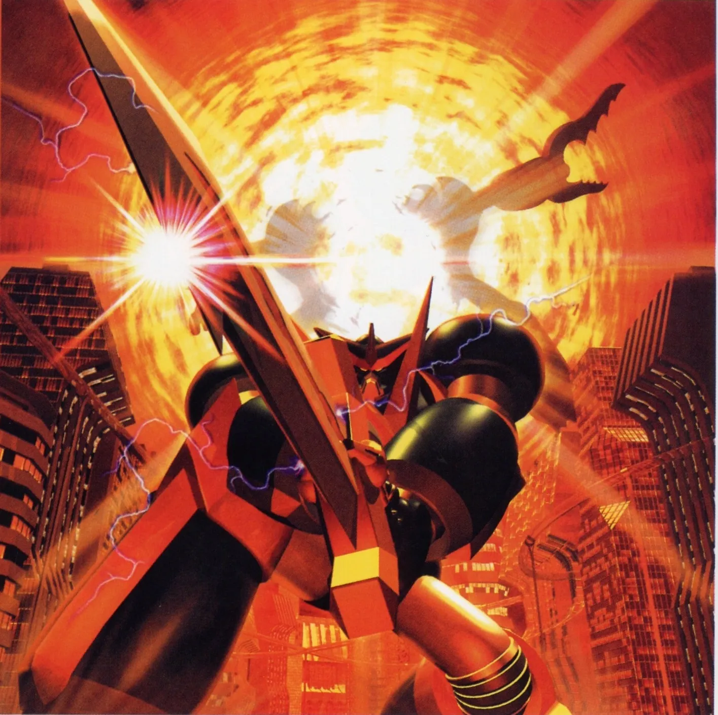
The overseas jacket emphasizes the battle. Capcom Design Works, printed p. 125 / PDF p. 126; credited to 酒井奨, with SOFTIMAGE 3D and Photoshop listed as tools. © Capcom.
The Japanese jacket shown at the top of this article makes an equally strong image out of a quieter moment. Credited to SENSEI, with Photoshop and Painter listed, it brings us close enough to study the robot’s head. The pilot’s platform and the workers below do the work of establishing size. Industrial structures frame the machine as something maintained and inhabited.
The two pictures offer different routes into the same premise. The overseas illustration makes the viewer imagine the fight. The Japanese one makes the viewer imagine approaching the robot. In the first, the weapon dominates the composition; in the second, the small human figure is crucial. Remove that person and the scale becomes less immediate, while the relationship at the heart of the image largely disappears.
That human relationship recurs throughout the section. Capcom’s artists keep finding ways to place the person and the machine together, whether the setting is a battlefield, a hangar, or a brightly colored character montage.
A whole entertainment world around the fight
Printed page 130 includes artwork identified as jackets for a drama CD and a theme-song CD. In the drama-CD illustration, Junpei and a supporting cast crowd the foreground while Kikaioh rises behind them. Gestures and expressions compete for attention. The image promises conversation, comedy, and personalities large enough to fill a scene even when the robot is standing still.
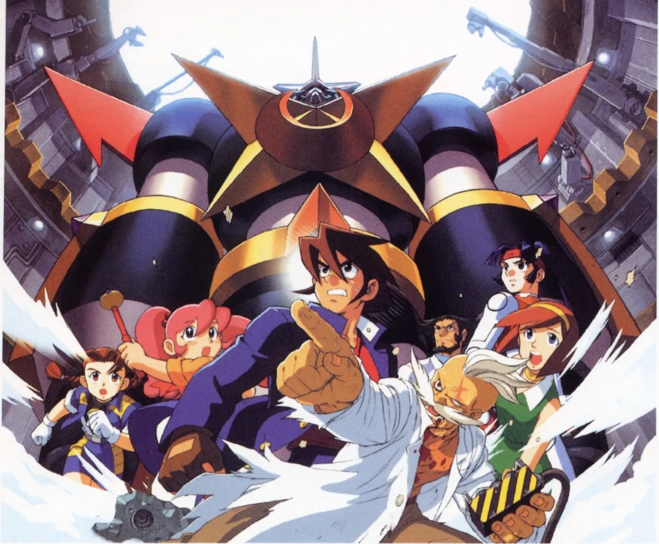
An ensemble built for more than combat. Drama-CD jacket illustration by SENSEI, Capcom Design Works, printed p. 130 / PDF p. 131. © Capcom.
The theme-song jacket places Junpei in front of a more solemn Kikaioh holding a sword. A particularly useful production comment explains that the illustration’s layers allow the sword-bearing robot to be used separately. It is a small glimpse of the practical work beneath the spectacle: an image can serve a particular cover while its parts remain useful for another arrangement. The finished picture is also a working asset.
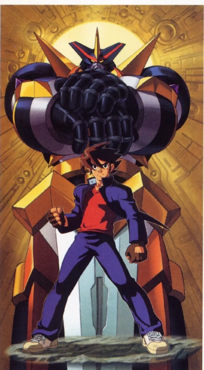
Hero and machine share the theme-song CD jacket. Illustration by SENSEI, Capcom Design Works, printed p. 130 / PDF p. 131. The accompanying comment describes separating the robot through the image’s layers. © Capcom.
The home game continues that sense of a world to explore. The manual describes Dr. Tatsumi’s Techno-Dome, a Development Room for unlocking hidden features, and downloadable VMU mini-games whose earnings can contribute to that process. These extras turn the Dreamcast release into something a player can return to between fights.
Viewed together, the CD art, the cast portraits, and the home-game extras make the project feel unusually willing to indulge its own fiction. The pilots are present enough to carry comedy and drama. The robots are distinctive enough to headline separate adventures. A fighting game provides the common stage where all of those possibilities can meet.
That is what the Capcom Design Works pages preserve so well. Tech Romancer takes the excitement of looking across a shelf of wildly different robot stories and makes the choice playable. You can pick the machine that looks like it belongs to your favorite kind of show, then let the rest of that impossible television schedule come looking for a fight.
Artwork and production notes come from the supplied Japanese edition of Capcom Design Works, printed pp. 125–131 / PDF pp. 126–132. Image excerpts preserve the original scanned artwork. Descriptions of mood and genre are editorial interpretations; gameplay details come from Capcom’s North American Dreamcast manual. The 1998 interview is linked in English translation.
Sources
- Capcom Design Works — Tech Romancer / Choukou Senki Kikaioh · Capcom / Enterbrain · 2001 · page 125–131 · scan page 126
- Cyberbots — 1998 developer interview, including the announcement of Tech Romancer · Gamejin, October 1998; English translation by shmuplations · 1998
- Tech Romancer — North American Dreamcast instruction booklet · Capcom Entertainment · 2000 · page 4, 6–9, 11–12, 14, 18, 20–21 · scan page 6
- Tech Romancer - Dreamcast - intro · adventkamen / YouTube