From the archive Street Fighter II
Wrapped Around the Drum Scanner
A 1995 Capcom art book shows Street Fighter II's key art in its makers' words: a Japanese poster begun over a Hokkaido New Year, an overseas promo painted in about three days and wrapped around a scanner drum, and a Super Turbo poster undone by Gouki.
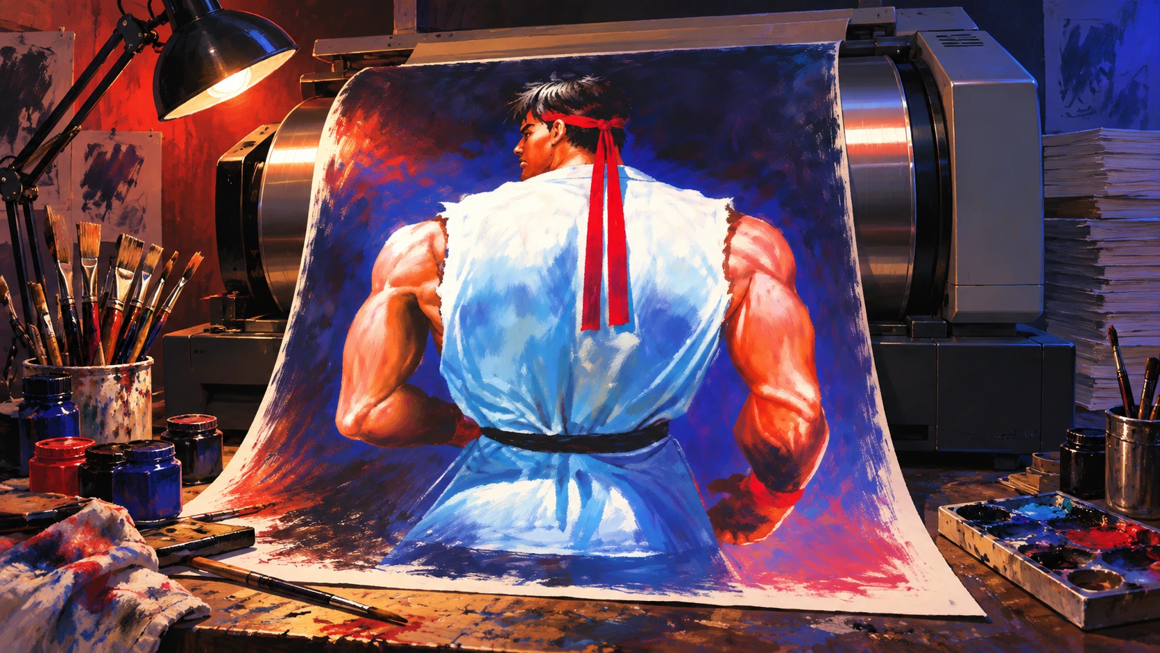
Original editorial illustration inspired by AKIMAN’s overseas promotional painting and his account of its scanning. The historical art appears below.
AI editorial illustration · Rewind: Northwest RetroDesign reference ↗01 Historical source
Shinseisha · p. 049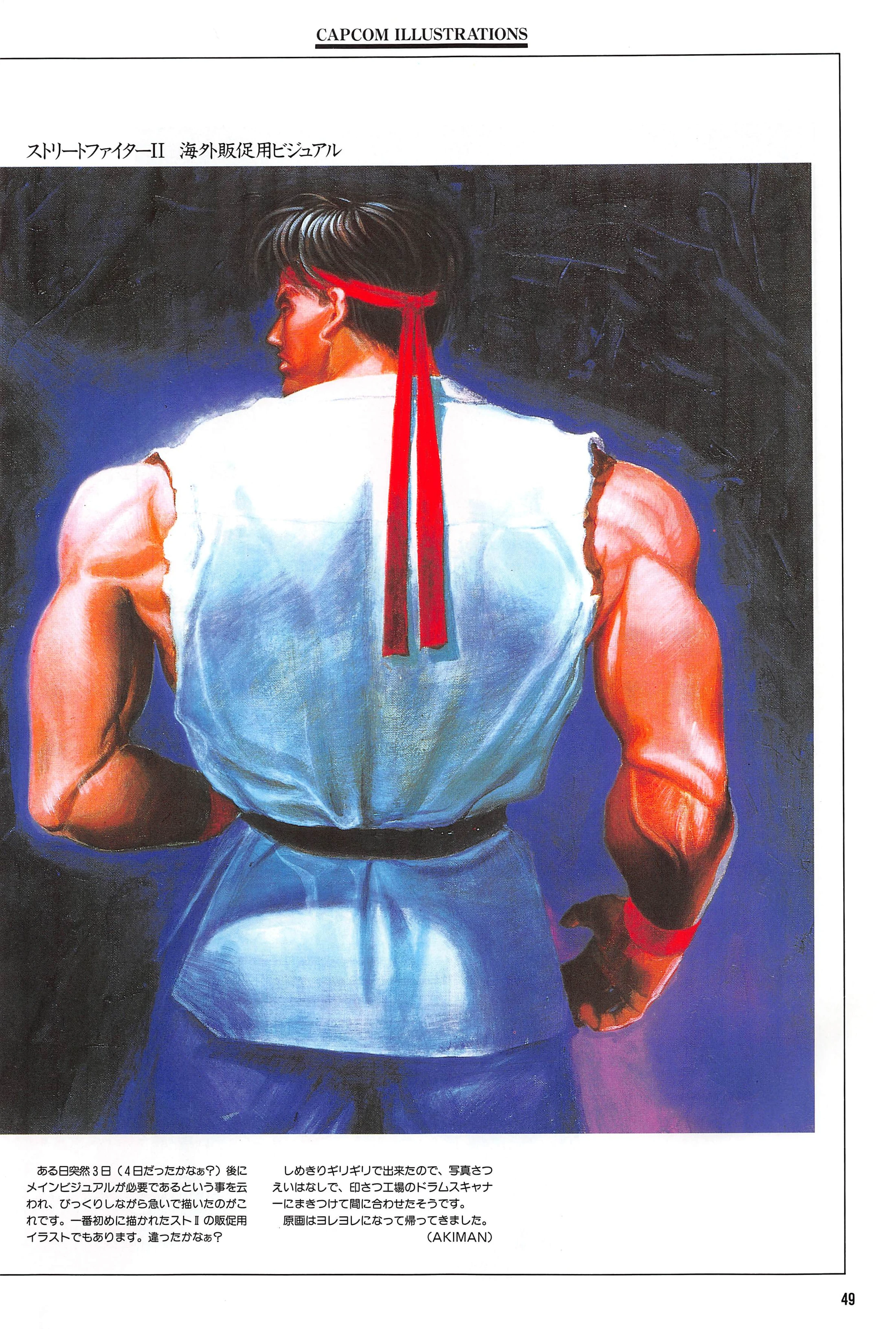
AKIMAN's Street Fighter II "visual for overseas sales promotion." He says he was told one day that a main visual was needed in three days ("or was it four?"). The painting was finished so close to the deadline that, he was told, it went onto the print shop's drum scanner without being photographed first, and it came back "all battered" (working translation).
Capcom Illustrations · Shinseisha, 1995 · printed p. 049 · scan p. 53Turn to page 49 and Ryu has his back to you. His sleeveless white gi fills the frame, a black belt sits low on his hips, and the tails of his red headband hang down between his shoulder blades. The one-line label above the painting reads ストリートファイターII 海外販促用ビジュアル: “Street Fighter II: visual for overseas sales promotion.” Capcom Illustrations, p. 049. (All Japanese quotations in this Story are working translations.)
The book is Capcom Illustrations, volume 17 of the Gamest Mook series from Shinseisha. The first printing is dated December 2, 1995. The Internet Archive scan is the fourth printing, dated July 31, 1996. Capcom Illustrations, colophon (scan page 166). Most plates carry a few lines from the artist; read together, the Street Fighter II pages show how some of the game’s key art got made.
The definitive version
In the Japanese main visual on p. 007, Ryu faces forward. He raises a red-wrapped fist. Behind him, E. Honda, Zangief, Ken, Chun-Li, Guile, Blanka and Dhalsim crowd a blue sky, and a huge dark-blue globe curves across the bottom of the painting. (The names are ours; the caption lists none.)
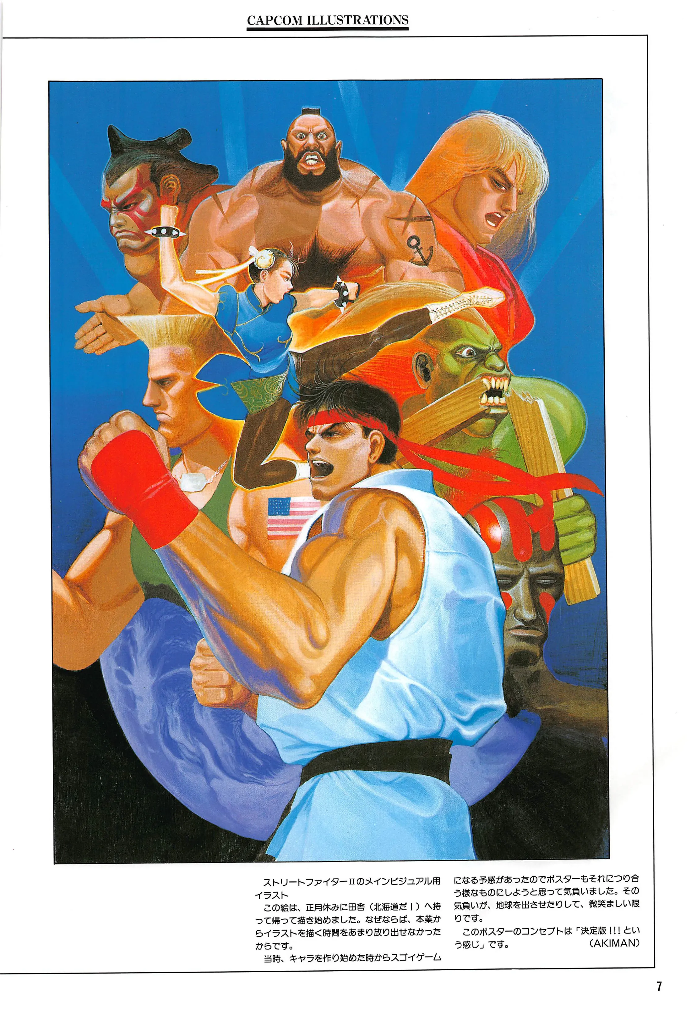
AKIMAN’s main visual for Street Fighter II. He says he took the painting home to his hometown in Hokkaido over the New Year holiday to work on it, put the Earth in out of sheer eagerness, and gave the poster a “definitive version!!!” feel (working translation). Capcom Illustrations · Shinseisha, 1995 · printed p. 007 · scan p. 11.
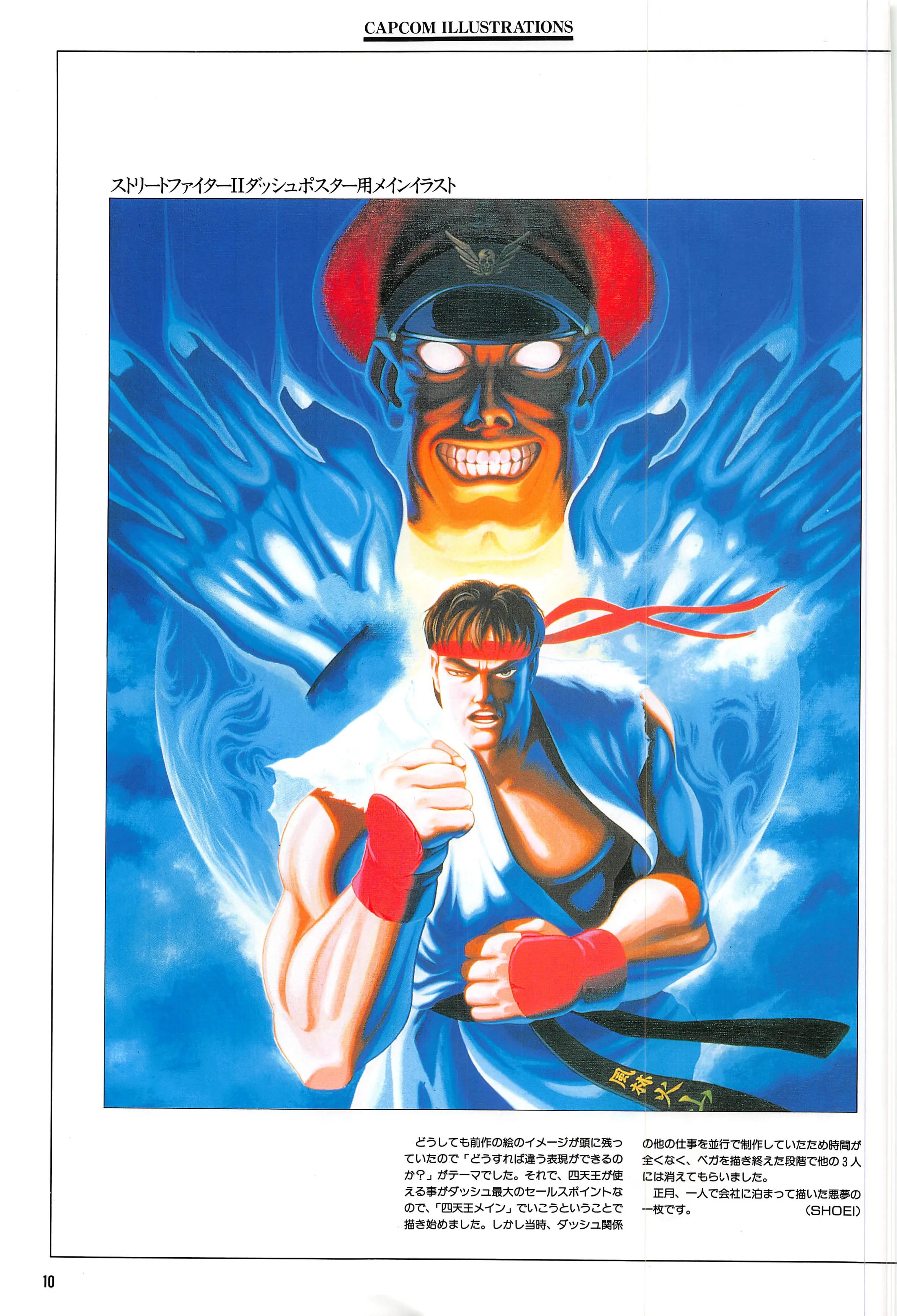
SHOEI’s main illustration for the Street Fighter II Dash poster. He planned it around the four bosses, but with no time to spare, he says, “once I’d finished drawing Vega, I had the other three disappear.” He painted it over New Year, staying overnight at the office alone (working translation). Vega is the Japanese name of the boss English-language releases call M. Bison (ESPN, 2012). Capcom Illustrations · Shinseisha, 1995 · printed p. 010 · scan p. 14.
The caption reads: “Illustration for Street Fighter II’s main visual. I took this painting home to my hometown (Hokkaido!) over the New Year holiday and started it there, because I couldn’t spare much time from my main job to paint illustrations.” It goes on: “From the time we started making the characters, I had a feeling it would be an amazing game, so I was fired up to make the poster live up to it. That eagerness had me doing things like putting in the Earth, which makes me smile now. The concept for this poster is a ‘definitive version!!!’ kind of feel.” The caption is signed AKIMAN. Capcom Illustrations, p. 007.
The facing page gives the game’s release as March 1991 and calls it a hit “that could be called a social phenomenon.” Capcom Illustrations, p. 006. AKIMAN doesn’t say which New Year he means, and the book doesn’t date the painting.
“My main job” is a telling phrase. The book’s preface says Capcom had doubts about leaving advertising and image illustration to outside hands, so it pulled staff from development into a Design Room to handle art for advertising, promotion and posters. Capcom Illustrations, p. 002. In the book’s roundtable interview, SHOEI, who introduces himself as head of the Design Room, says that until the room was staffed up, planners and pixel artists were asked to draw illustrations as each need came up. Capcom Illustrations, p. 128.
SHOEI spent a New Year on a poster too. His Street Fighter II Dash poster illustration on p. 010 shows Ryu before the capped boss, who looms over him in blue flame. Playable Four Heavenly Kings were Dash’s biggest selling point, SHOEI writes, so he planned the poster around all four. But he was making other Dash material at the same time, he explains, so “I had no time at all, and once I’d finished drawing Vega, I had the other three disappear. It’s a nightmare of a picture that I painted over New Year, staying overnight at the office alone.” Capcom Illustrations, p. 010. In the roundtable, he adds that on Dash he handled everything alone, from main illustration to logo to game graphics, working straight through New Year, until he asked for help and Kinu Nishimura joined. Capcom Illustrations, p. 130.
Three days, no photograph
Back to the Ryu with his back turned. AKIMAN’s caption on p. 049: “One day I was suddenly told a main visual was needed in three days (or was it four?), and this is what I painted in a hurry, astonished. It’s also the very first sales-promotion illustration drawn for Street Fighter II. Or was it?” He continues: “It was finished right at the deadline, so I’m told that instead of photographing it, they wrapped it around the printing plant’s drum scanner to make it in time. The original came back all battered.” Capcom Illustrations, p. 049.
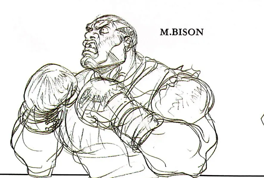
The book labels this pencil boxer “M.BISON,” his Japanese name. English-language releases called him Balrog and gave the name M. Bison to the capped boss (ESPN, 2012). Capcom Illustrations · Shinseisha, 1995 · printed p. 022 · scan p. 26.
In other words, as AKIMAN heard it, the painting itself went onto the drum in place of a photograph of it. AKIMAN hedges on the number of days and on whether this was the first promo piece, and he marks the scanner story as something he was told (そうです), not something he saw. The caption names no country and doesn’t say whether the art became a flyer, a poster or an ad. “Overseas” (海外) is as specific as it gets.
The book also keeps Capcom’s Japanese names, even in Roman letters. On p. 022, a pencil boxer in gloves is labeled M.BISON, and SHOEI calls the capped boss Vega, both on p. 010 and on his p. 047 plate of the same character. Capcom Illustrations, pp. 010, 022, 047. Outside Japan, the boxer became Balrog and the capped boss became M. Bison. Street Fighter executive producer Yoshinori Ono, speaking through a translator, told ESPN in 2012 that there was “no reason” for the swap; switching the programming numbers was simply “the easiest way.” ESPN, 2012. Ono joined Capcom in 1993, after the game’s 1991 release, so his is a later company account. Eurogamer, 2012. The art book, written for Japanese readers, uses only the Japanese names and doesn’t explain the switch.
The poster Gouki undid
On p. 027, Cammy and Chun-Li stand back to back on a cobbled ledge above city lights under a dusk sky, with a crow at their feet. The header reads “Super Street Fighter II X: for Gamest special issue.” BENGUS explains: “I was drawing this for the Super II X poster, but partway through it was decided that a new character (Gouki) would appear, and it was rejected. There was also an idea to float Gouki’s face in the sky, but I’m glad we didn’t.” Left half-finished, “it was revived as a special-issue cover. Now I’m relieved it wasn’t the poster.” Capcom Illustrations, p. 027.
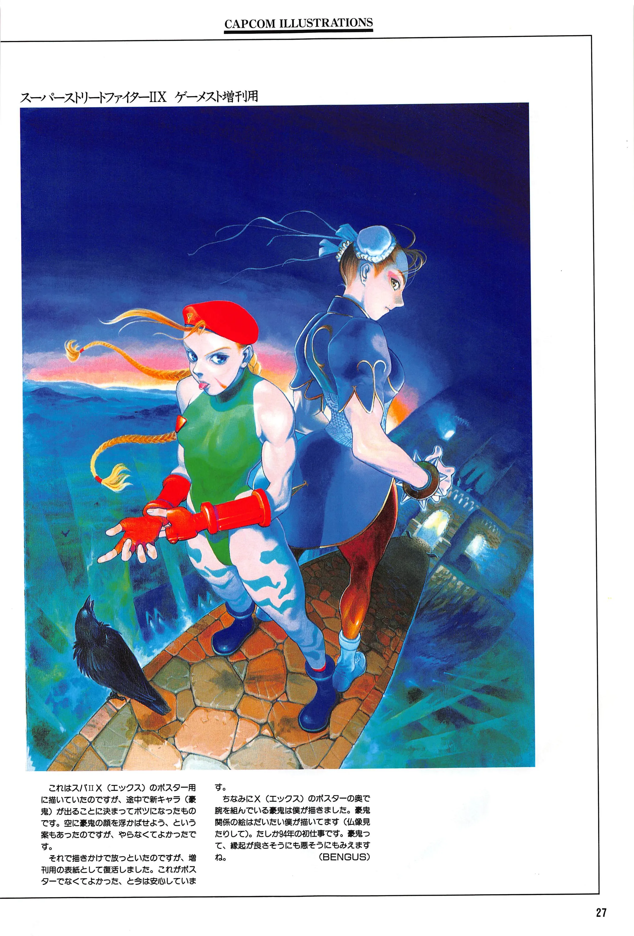
BENGUS was painting this for the Super Street Fighter II X poster when it was decided partway through that a new character, Gouki, would appear, and the piece was rejected. It was later revived as a Gamest special-issue cover (working translation). Outside Japan, the game was Super Street Fighter II Turbo, and Gouki is Akuma (Capcom support FAQ; Capcom Street Fighter 6 character pages). Capcom Illustrations · Shinseisha, 1995 · printed p. 027 · scan p. 31.
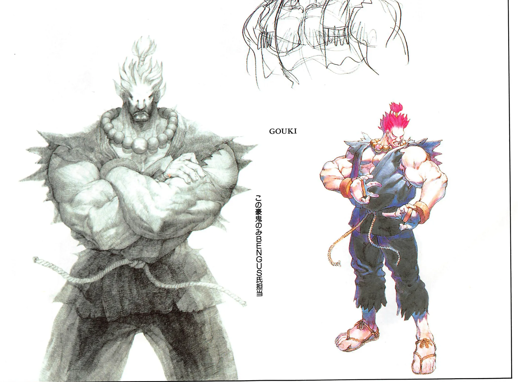
From the Super Street Fighter II X pencil spread whose companion note is headed “Main (line drawing).” A vertical note reads “Only this Gouki by BENGUS” (working translation). Elsewhere, BENGUS says he drew the Gouki with folded arms at the back of the X poster. The book doesn’t label this spread as poster art. The small color figure is uncaptioned. Capcom Illustrations · Shinseisha, 1995 · printed p. 023 · scan p. 27.
The book introduces Super Street Fighter II X (which it dates to March 1994) as a classic that “could be called the final evolution” of Street Fighter II, and as “Gouki’s memorable first appearance.” Capcom Illustrations, p. 022. Outside Japan, the game was released as Super Street Fighter II Turbo, and Gouki is called Akuma there. Capcom, support FAQ; Capcom, Street Fighter 6 character pages.
The poster that replaced BENGUS’s may survive in the book only in pieces. Pages 022–023 are a spread of pencil character drawings. On p. 022, a note headed “Main (line drawing)” from Kinu Nishimura says: “I like pencil drawing, so I could draw it fairly much the way I wanted. It hit me that this style was fine too; the scales fell from my eyes.” Capcom Illustrations, p. 022. On p. 023, a vertical note printed between a large pencil Gouki with folded arms and a small color Gouki reads “Only this Gouki by BENGUS.” Capcom Illustrations, p. 023. The note doesn’t say which figure it means. We take it to be the pencil one, because it fits BENGUS’s remark on p. 027: “the Gouki with folded arms at the back of the X poster was drawn by me,” and he says he draws most Gouki-related art “(looking at Buddhist statues and such).” Capcom Illustrations, p. 027. The book never identifies any image as the finished X poster or calls these drawings poster art. Linking them up is our inference from the captions.
In the roundtable, SHOEI says Super II X “is just a pencil drawing, but it was really deliberate.” Other departments told him to hurry up and produce a clean version, he recalls, but “in a world overflowing with color, I thought monochrome might be interesting instead.” The interviewer asks about a version with only Gouki colored. SHOEI answers: “It was decided that it would be used at an overseas show, so we had color added in a hurry.” Capcom Illustrations, p. 131. The English translation of this roundtable at shmuplations.com, a secondary source, gives the same exchange. shmuplations.com, 2021. SHOEI doesn’t say which Super II X piece he means, and the book doesn’t name the show or say which image, if any, on its pages is that colored version.
That’s the limit of what the book can prove. These are the artists’ own accounts, first printed in 1995, one to several years after the work. They show Capcom’s Japanese artists making art for overseas use, sometimes in a rush, and a new character reshaping a poster. They don’t give dates or campaigns, or show how this art reached American arcades. The two Ryus are what’s certain. One faces forward, painted with a “definitive version!!!” feel. The other turns away, and he came back from the scanner battered.
Sources
- Capcom Illustrations — Street Fighter II overseas sales-promotion visual · Shinseisha · 1995 · page 049 · scan page 53
- Capcom Illustrations — Street Fighter II main visual · Shinseisha · 1995 · page 007 · scan page 11
- Capcom Illustrations — Street Fighter II introduction and special-issue cover · Shinseisha · 1995 · page 006 · scan page 10
- Capcom Illustrations — "A word from Capcom" preface · Shinseisha · 1995 · page 002 · scan page 6
- Capcom Illustrations — Street Fighter II Dash poster main illustration · Shinseisha · 1995 · page 010 · scan page 14
- Capcom Illustrations — Vega plate (SHOEI) · Shinseisha · 1995 · page 047 · scan page 51
- Capcom Illustrations — Super Street Fighter II X introduction and "Main (line drawing)" · Shinseisha · 1995 · page 022 · scan page 26
- Capcom Illustrations — Super Street Fighter II X pencil drawings, Gouki · Shinseisha · 1995 · page 023 · scan page 27
- Capcom Illustrations — Super Street Fighter II X, for Gamest special issue (rejected poster) · Shinseisha · 1995 · page 027 · scan page 31
- Capcom Illustrations — Capcom Design Room roundtable interview, opening · Shinseisha · 1995 · page 128 · scan page 132
- Capcom Illustrations — Capcom Design Room roundtable interview, SHOEI on Dash · Shinseisha · 1995 · page 130 · scan page 134
- Capcom Illustrations — Capcom Design Room roundtable interview, SHOEI on Super II X · Shinseisha · 1995 · page 131 · scan page 135
- Capcom Illustrations — colophon (4th printing) · Shinseisha · 1995 · scan page 166
- Capcom Design Room – 1995 Artist Interview (English translation) · shmuplations.com · 2021
- Curious case of M. Bison in 'Street Fighter' — Yoshinori Ono on the name switch · ESPN (Jon Robinson) · 2012
- The Rise and Collapse of Yoshinori Ono — Ono's 1993 start at Capcom · Eurogamer (Simon Parkin) · 2012
- Street Fighter 30th Anniversary Collection International — support FAQ, online play (Japanese) · Capcom · 2026
- Street Fighter 6 — Akuma · Capcom · 2026
- Street Fighter 6 — 豪鬼 (Gouki) · Capcom · 2026
Artwork and toy photographs are credited reproductions from published sources.