From the archive Valkyrie Profile
Lenneth’s Sprites Came First: The Yoshinari Brothers on Valkyrie Profile
Lenneth’s braid, Kashell’s retakes, Lezard’s heavy clothes and Meltina’s greenish hair: the Yoshinari brothers’ comments reveal the decisions behind Valkyrie Profile’s finished character art.
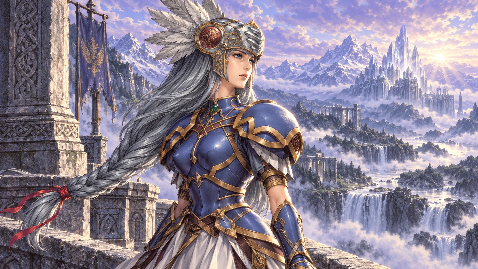
Original editorial illustration inspired by Lenneth’s design sheet. It is not artwork by the Yoshinari brothers.
AI editorial illustration · Rewind: Northwest RetroDesign reference ↗01 Historical source
SoftBank Publishing · p. 34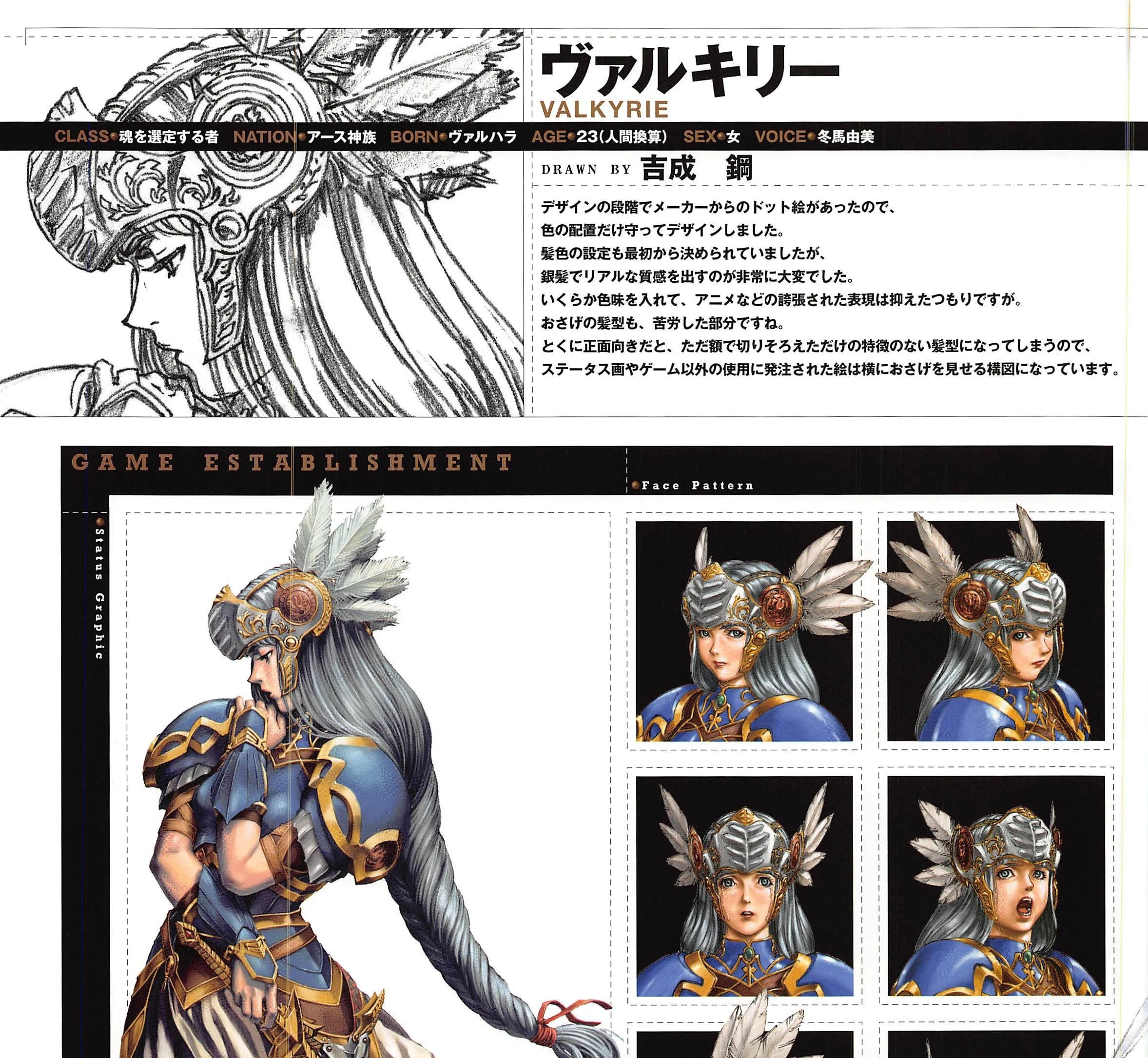
Lenneth’s sheet combines Kou Yoshinari’s comment with her status art and facial expressions. The angled portraits let the braid show.
Kou Yoshinari · SoftBank Publishing, 2000, p. 34 · © tri-Ace / Production I.G / Actas / ENIXLenneth’s character art did not begin with a blank page. Game sprites already existed. Kou Yoshinari says he kept their color arrangement while developing her illustration—a reversal of the easy assumption that the large painting must have come first.
A braid that needs a side view
The lead sheet shows the result: silver hair, armor, several expressions and a pencil rough. Kou recalls the difficulty of giving the silver hair a convincing texture. The braid posed a more practical problem: seen straight on, it largely disappears behind the head. He therefore favored angles that let it show in status art and commissioned illustrations. Character comment, printed p. 34 / PDF p. 39.
It is a small compositional choice with a visible consequence. The side-facing portraits let the hairstyle contribute to her silhouette instead of leaving the viewer with only a straight fringe.
Two brothers, different starting points
The book’s opening conversation contrasts Kou’s interest in recognizable real forms with You Yoshinari’s emphasis on silhouette. Kou describes bringing familiar forms together to give an imagined character presence. You wants to protect the first distinctive shape, especially when it becomes small game art.
They divided the cast without extensive meetings to unify every design. The conversation presents their shared color sense and different approaches as a source of variety. Their individual comments are more candid still: neither brother claims every character arrived fully resolved. Opening conversation, pp. 2–3.
Kashell and Lezard: the difficult ones
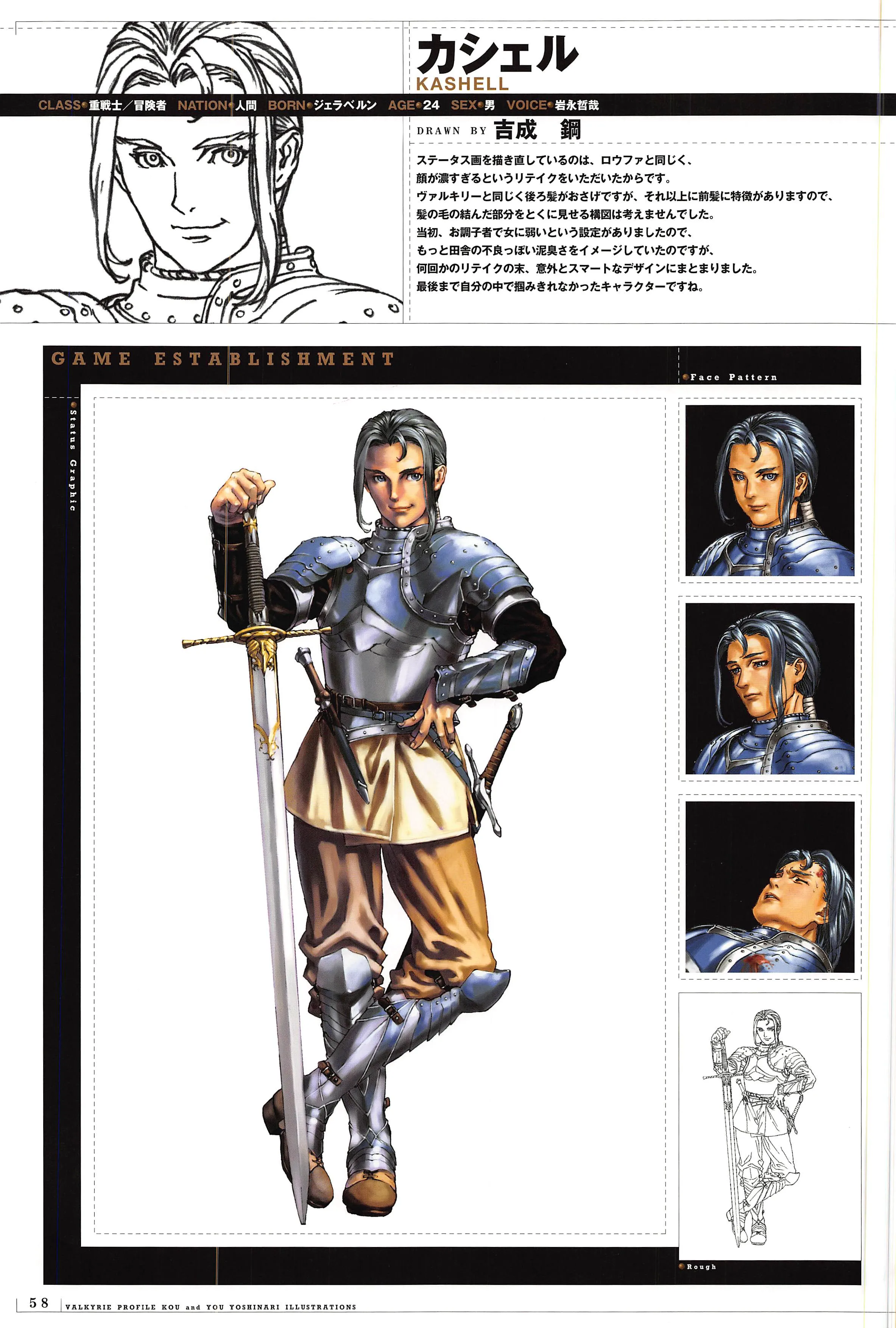
Kashell’s published character art and expression studies, beside the printed comment about repeated retakes. Kou and You Yoshinari · SoftBank Publishing, 2000, p. 58.
Kou says Kashell’s status portrait was redrawn after a request for a less heavy-looking face. His initial image of a rough country delinquent became a smarter-looking design through retakes. The finished sheet’s clean armor and composed face are the result we can see; the comment records the uncertainty behind them.
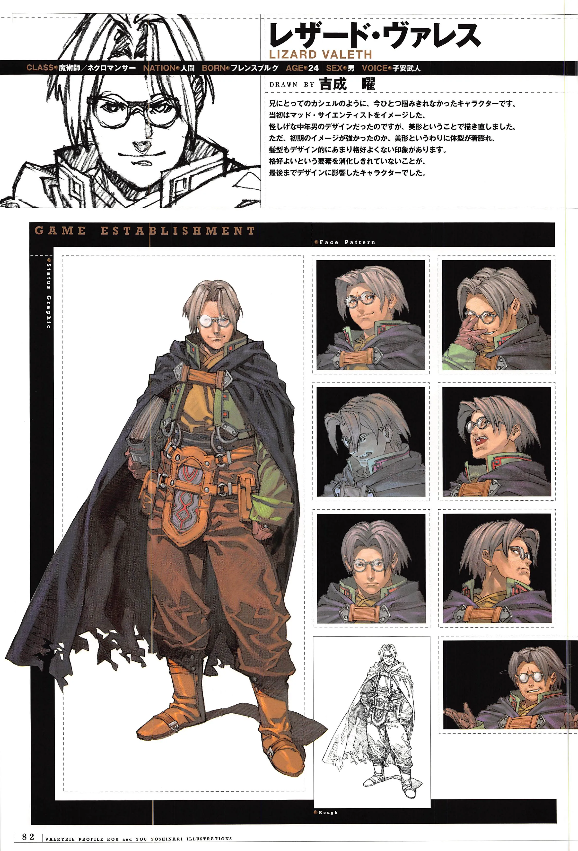
Lezard’s published sheet shows the young face and bulky layered clothing discussed by You Yoshinari. Kou and You Yoshinari · SoftBank Publishing, 2000, p. 82.
You makes a parallel admission about Lezard. An initial suspicious, middle-aged scientist became a handsome young man. He felt that the earlier idea still lingered in the bulky clothing and awkwardness of the design. The sheet lets us inspect that tension between the youthful face and heavy layers. It is not a before-and-after record of the discarded middle-aged version. Kashell, p. 58; Lezard, p. 82.
The blonde hair that turned greenish
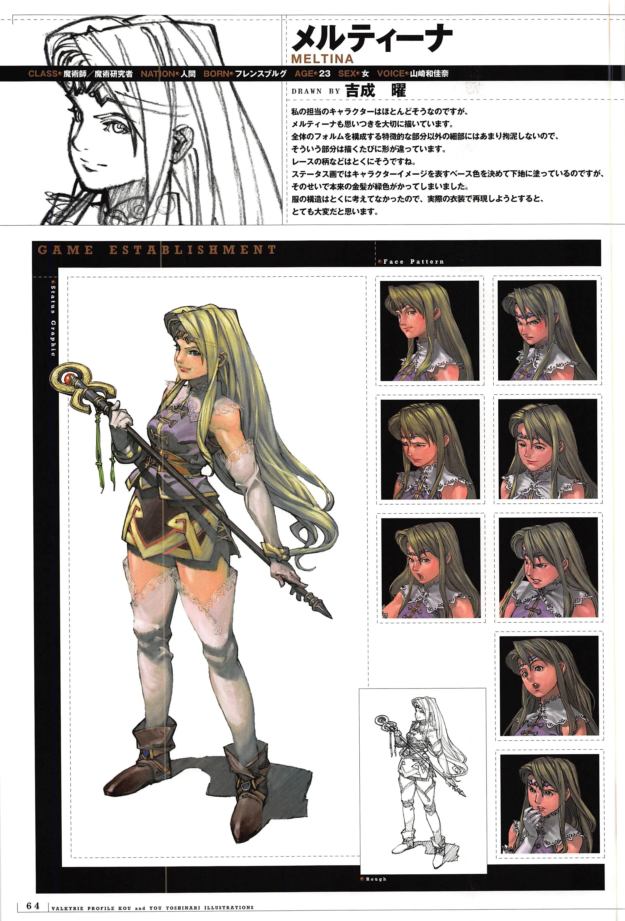
Meltina’s published character art and face studies. The comment links the greenish cast of her intended blonde hair to the painting’s base color. Kou and You Yoshinari · SoftBank Publishing, 2000, p. 64.
Meltina makes You’s approach especially tangible. He kept the first overall idea but allowed details such as lace patterns to vary. He chose an underpainting color to express the character’s impression, and says that choice made her originally blonde hair greenish. He also admits that the costume’s construction would be difficult to reproduce as actual clothing. Meltina, p. 64.
Look from the long hair to the fine lace, then back to the broad silhouette. The character holds together even where the artist says the details were unsettled. These comments give the finished pictures something an immaculate gallery cannot: the braid composed around, the portrait redrawn, the color that drifted. The memorable designs contain decisions their makers were still arguing with.
Source and translation note
The source is SoftBank Publishing’s 2000 Valkyrie Profile illustration collection, first printing April 6. The new images are native page images from the supplied original PDF, with no retouching. Japanese comments are paraphrased from working translations; no fluent-reader certification is claimed. The book prints VALKYRIE and LIZARD VALETH; prose uses Lenneth and Lezard. Printed page numbers are five below PDF page numbers.
Sources
- VP Illustrations — opening essay, part 1 · SoftBank Publishing · 2000 · page 2 · scan page 7
- VP Illustrations — opening essay, part 2 · SoftBank Publishing · 2000 · page 3 · scan page 8
- VP Illustrations — contents · SoftBank Publishing · 2000 · scan page 9
- VP Illustrations — Kou Yoshinari Illustration 2 data and rough · SoftBank Publishing · 2000 · page 8 · scan page 13
- VP Illustrations — VALKYRIE · SoftBank Publishing · 2000 · page 34 · scan page 39
- VP Illustrations — KASHELL · SoftBank Publishing · 2000 · page 58 · scan page 63
- VP Illustrations — MELTINA · SoftBank Publishing · 2000 · page 64 · scan page 69
- VP Illustrations — LIZARD VALETH · SoftBank Publishing · 2000 · page 82 · scan page 87
- VP Illustrations — First Plot · SoftBank Publishing · 2000 · page 118 · scan page 123
- VP Illustrations — author profiles · SoftBank Publishing · 2000 · page 127 · scan page 132
- VP Illustrations — colophon · SoftBank Publishing · 2000 · scan page 133
Artwork and toy photographs are credited reproductions from published sources.